July 13, 2014

Time and Date Confusion 1

Part 1 Formatting Functions


A common cause of issues on the QlikCommunity forum is date fields and the use of the formatting and interpretation functions.

First of all, let me state that there is no specific date data type in Qlikview. There are only two data types in Qlikview – text (or character) and number (or numeric). All number values are actually ‘duals’ – a dual has a text representation and an underlying numeric value. A date is simply a dual value with formatted text representation and an underlying value described below.

The integer portion of a date is the number of days since midnight of December 31 1899. So 1 January 1900 is day 1. July 7 2014 is day number 41827. This is identical to Excel and SQL Server as well as many other products.

The fractional portion of a date/time value represents the proportion of 1 day. So 41827.0 is time 00:00 on 7 July. 41827.25 is 6:00am (0.25 * 24). A pure date has a fractional part of 0. A pure time has only a fractional part (0.000000 – 0.9999999). 

An interval has both parts where the integer part represents days and the fractional part represents portions of a day, So 0.75 is an interval of 18 hours (0.75 * 24) or 1 080 minutes (0.75 * 24 * 60) and 1.5 is an intrerval of 25 hours.

One important point is that the value of the date dual is the underlying numeric, regardless of the chosen text representation.

So lets move on to the formatting functions:

  • Date(numericvalue[, format])
  • Time(numericvalue[, format])
  • Timestamp(numericvalue[, format])
  • Interval(numericvalue[, format])

Where numeric value is the date value and format is the optional format. If the formatted is omitted it will format the value to the default for your environment/locale.

These functions format only the text representation of the date/time dual. The underlying numeric value is not affected. So the text output of the following two expressions are identical, but the values are not equal:

                Date(‘2014/07/10 09:00:00’, ‘YYYY/MM/DD’)  = 41830.375
                Date(‘2017/07/10’, ‘YYYY/MM/DD’) = 41830.000

I have also often seen constructions such as Max(Date(someField)) or Date(someField)+2. The Date() format function is not required in these expressions, and only serves to clutter the expression, and in extreme cases may also affect performance.    

The most important points to take away from this are:

  1. the value of the date is the numeric value of the dual and
  2. the formatting functions only affect the text representation of  the date/time

June 14, 2014

About Table Concatenation

Concatenation

 According to the Qlikview Reference Manual:
If two or more statements result in tables with identical field names, the tables are concatenated and treated as one logical table.
Let’s explore this statement. Consider the load script:

Table1:
LOAD * Inline
[
A, B, C
1, 2, 3
4, 5, 6 ];

Table2:
LOAD * Inline
[ A, B, C
6, 5, 4
4, 5, 6 ];

If you run this script, there will only be one table – Table1. This table contains all 4 lines loaded, including the line 4, 5, 6, which will be loaded twice. Click File | Table Viewer (or Ctrl-T) and check the table contents in Table1.

Now if we add the lines:

Table3:
LOAD * Resident Table1;

Table3 will not be created, as it contains the same fields as Table1 and will be concatenated. Now there will be 8 records in Table1. So if the tables have the same fields, they will autoconcatenate. The field order is unimportant, but remember that QV field names are case sensitive.


Avoiding Automatic Concatenation

If the table is created with different fields, then the second table will not be concatenated. But what if you need to reload the data from the resident table? Add the lines

Table4:
NoConcatenate
LOAD * Resident Table1;

Now Table4 is not concatenated to Table1. (If the scripts end at this point we will have a synthetic key, but that is the subject of another post).

Note that if the second table is created with different fields (a subset of the first table’s fields), then it will not be concatenated, even subsequent statements add the missing field(s) or drop the extra fields. Look at this example:

Table1:
LOAD * Inline
[ A, B, C
1, 2, 3
2, 5, 6
3, 6, 7 ];

Table2:
LOAD A, B
Resident Table1;

 Join(Table2)

LOAD A, (A+B) As C
Resident Table1;

Table2 will be created as a new table because it contains only a subset of Table1’s fields when it is created. This does not change when we add a column C to the table as the table already exists.

So the manual text should more accurately say:
If two or more statements create tables with identical field names, the tables are concatenated and treated as one logical table.

January 12, 2014

Understanding Aggr()

Aggr() is an important part of the toolkit that you need when building more complex expressions and calculated dimensions in Qlikview. This post attempts to demystify aggr() and show it can be used.
 

In a Qlikview chart, such as a straight table, the chart expressions are evaluated for all possible combinations of the dimension. An Aggr() function does the much same, so the expression:

Aggr(Sum(Sales), Region)

Produces a list of the summed values, one for each region. And this:

Aggr(Sum(Sales), Region, Period)

 
Produces an array of sales for each region/period combination. Three dimensions would construct a cube, and so on. 


You may use the aggr() expression anywhere that expects a list or array of values (technically an n-dimensional hypercube). This may include in a list box, a calculated dimension or in a nested aggregation. 

A nested aggregation is where one aggregation function (eg Sum, Min, Avg etc, not to be confused with the aggr() function) is contained within another. For example, lets say you would like to know the lowest possible summed value (eg Min(Sum(Sales))) for the sales outlets. Sum(Sales) will return a single value, but you need a list of Sum(Sales) by store. This is where aggr() comes in.  The expression becomes    

Min(Aggr(Sum(Sales), Store)) 


For another example, Lets say you want to know the lower 5% and upper 95% percentile of sales by Store:

Fractile(Aggr(Sum(Sales), Store), 0.05)
Fractile(Aggr(Sum(Sales), Store), 0.95)


If the data was arranged in months, and you wanted the expression should be calculated to each month (in a chart with month as a dimension):

Min(Aggr(Sum(Sales), Store, Month))
Fractile(Aggr(Sum(Sales), Store, Month), 0.05)
Fractile(Aggr(Sum(Sales), Store, Month), 0.95)

 
If you have more than one year, you would of course need to have a single year selected before using this chart/table, or you could do something like:

Min(Aggr(Sum({} Sales), Store, Month))
Fractile(Aggr(Sum({
} Sales), Store, Month), 0.05)
Fractile(Aggr(Sum({
} Sales), Store, Month), 0.95)

Aggr() expressions in a chart

 
When you use an aggr() in a chart, it is important to always include ALL the chart dimensions in the aggr() dimensions. This allows the expression to be calculated correctly in each cell in the chart or table.


This can present a problem if you are using calculated dimensions, as the dimensions in the aggr() statement have to be fields, not expressions. If the calculated dimension is simple and based on a single field, and each value corresponds to a single value of that field, then you may be able to use the field name in the aggr() expression.

January 6, 2013

Paged charts in Qlikview

Qlikview does not have a built-in paging mechanism for charts and tables. By paging, I mean returning a portion of the results (say top 5 salespeople), with "next" and "previous" buttons to view other portions - in the same way a web search with Google or Bing returns one page at a time.

To illustrate, this is a simple paged chart in Qlikview:
 

Here's how to do it.
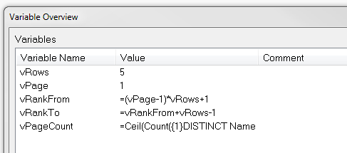
  • Create the following variables
    • vRows - contains the number of rows to display per page - 5 in this case
    • vPage - the page number. Initialise to 1 for the first page.
    • vRankFrom - the expression  =(vPage-1)*vRows+1
    • vRankTo - the expression  =vRankFrom+vRows-1
    • vPageCount - the expression  =Ceil(Count({1}DISTINCT Name)/vRows)
    • Note the = sign on the three expressions
    •  
    Set these variables


  • Create 3 text boxes
    • "Previous" or "<<"
      • Lable the first one "<<" or "Prev" (or whtaver makes sense in your situation). 
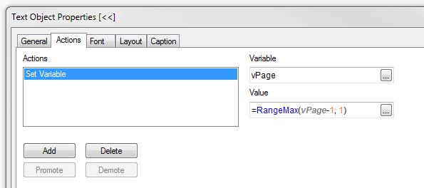
      • Create a set variable action for vPage with the following expression:
        =RangeMax(vPage-1, 1)
        .
        The RangeMax ensures that vPage will not be less than 1.
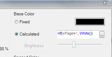
      • Optionally set the font colour to black, and add the following calculate colour expression:
        =If(vPage=1, White())
        (Set to whatever colours you like to indicate active and disabled states)
    • "Next" or ">>"
      • As above, but use =RangeMin(vPage+1,vPageCount) for the vPage set variable action and =If(vPage>=vPageCount, White()) for the calculated colour expression.
    • Page lable - this is a simple textbox displaying the expression:
      ='Page ' & vPage & ' of ' & Ceil(Count(Distinct Name) / vRows)
  • Create the chart. We need a chart with some sort of ordering such as ranking salespeople by sales volumes. In the example the chart expression is simply Sum(Value), and we will sort by this value. The dimension is the field [Name]. To adapt it to work with the ranking, use the following calculated dimension to limit the values to the current page:

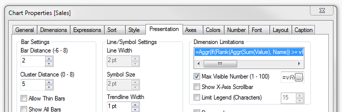
    =Aggr(If(Rank(Aggr(Sum(Value), Name)) >= vRankFrom And Rank(Aggr(Sum(Value), Name)) <= vRankTo, Name), Name)

    (The ranking functions wrap the chart expression (red) returning the dimension values (blue) that fall inside the range specified vt the vRankFrom and vRankTo variables). 
  • On the sort tab, select Sort by "Y-value" descending.
  • One the Presentation tab,  check the "Max Visible Number" box and enter the expression =vRows in the expression box.
Here is a QV document that implements the paging described above:

DataPaging.qvw


Action for previous button
Colour settings for previous button

Max Visible Number setting on Presentation tab


January 5, 2013

Handy data discovery tool

Here's a handy tool to assist in the early development and analysis of the data coming into your Qlikview documents.  There are three objects that you can copy from the attached Qlikview document and paste into your document. You do not need to modify your data model or load script in any way as these objects use standard QV built-in fuctionality.

  • A tree-view list box with the tables and fields in your data model
  • A text box containing summary statistics for the selected field (hidden until a field is selected)
  • A dynamic list box containing the distinct values of the selected field (also hidden until a field is selected)

Here is a Qlikview document containing the 3 objects. Select a field name (any one) to make all three visible and copy from tis document into your Qlikview document.

Data Discovery.qvw

Creating the tools yourself

 If you are using QV Personal Edition, you will not be able to open the attached document, so here is how you can create these objects

The data structure listbox

Create a list box, select in the Field box, and enter the following expression:

=Aggr(Only({1} $Table) & '|' & Only({1} $Field), $Field, $Table)

Then check the "Show as TreeView" option and enter the vertical pipe "|" as the separator.


The text box

Create a text box, and add the following expression:

=Num(Count(Distinct [$(=$Field)]), '# ##0') & ' unique values
' & Num(Count([$(=$Field)]), '# ##0') & ' total values ('
 & Num(Count([$(=$Field)]) / (Count([$(=$Field)]) + NullCount([$(=$Field)])), '0%') & ')
' & Num(NullCount([$(=$Field)]), '# ##0') & ' null rows
' & Num(Count(If(Len([$(=$Field)])=0, [$(=$Field)])), '# ##0') & ' empty values'


On the Layout tab, add the following conditional expression:
Count($Field) = 1

The dynamic list box


Create a list box, select and add the expression:
=[$(=$Field)]

On the Layout tab, add the following conditional expression:
Count($Field) = 1

Conclusion

Remember to select a field in the data discovery list box to see the other two objects. Feel free to use and modify the objects in any way you please. With all the usual disclaimers...


October 16, 2011

Dual values for “self-sorting”

Sometimes you need a field that has a unusual sort order. For example, you might have an a range field that contains values <0, 0-10, 10-100, >100. When you use this field as a dimension in a table or chart, you will want to sort this in the order above. In many cases, this can be done by using the “Load Order” option, but there are cases where the natural load order may not work (calculated fields, for example).

The load order is also of no use if you plan to use the field in a rank expression.

In these case, one option is to create dual values for the field. A dual value contains a text representation and numeric value. Dates are numeric, containing the formatted date and numeric date representation. They display the formatted date, but sort using the numeric value. You can also perform arithmetic on the numeric value. But did you know that you can create your own, custom, dual values?

To do this, use the Dual() function. This is an example of a calculated field using Dual:

LOAD

...

If(IsNull(PaymentAmount) Or PaymentAmount = 0, Dual('None', 0),

If(PaymentAmount > 0.9 * ExpectedInstallment Or IsExempted, Dual('>90%', 90),

If(PaymentAmount > 0.5 * ExpectedInstallment, Dual('50 - 90%', 50),

If(PaymentAmount > 0 Or InSuspense, Dual('0% - 50%', 1),

Dual('Reversal', -1))))) As PayGroup,

FROM …

In this example, the load order does not reflect the required sort order, but values of Paygroup will sort according to the numeric value:

Reversal, None, 0% - 50%, 50% - 90%, >90%

Just remember to ensure that the “Numeric Value” sort option is selected when you need this sort order.

August 21, 2011

Howto: Create a Waterfall Chart

A waterfall chart is a type of cumulative bar chart, where each bar begins at the previous cumulative total and has a length equal to the value at that dimension (positive or negative). Something like this:


So, how do we go about this.

CREATE BAR CHART
Create a bar chart with the dimension you require for the X axis, and the following expressions:
  • Total (this is the value for the final, total bar - green in the example above)
  • Value (this is the value for the blue and red bars - rename as appropriate)
  • Cum (this is a hidden value which tracks the cumulative value)
For example, let's have a simple data set with fields Dim1 and Value1. There is a dummy Total with Dim1 = Total, Value1 = 0.

Use the expressions:

  • Total: If(Dim1 = 'Total', Sum(Total Value1))
  • Value: Sum(Value1)
  • Cum: RangeSum(Above(Column(3)), Column(2))

Set Cum to Invisible on the Expressions tab of the chart properties.

MAKE THE WATERFALL

The trick now is to use the bar offset on the Value expression and use this expression:

=If(IsNull(Above(Column(3))), 0, Above(Column(3)))+if(Column(2)<0,Column(2),0)

Click the + sign next to the expression name in the Expressions tab to see the Bar Offset.

That should do it. You can download a demo here : Waterfall demo

To colour the negative values red, set the Background Color for Value to the expression:

=If(Column(2)<0, RGB(200,110,130))

Have fun!