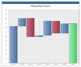
So, how do we go about this.
CREATE BAR CHART
Create a bar chart with the dimension you require for the X axis, and the following expressions:
- Total (this is the value for the final, total bar - green in the example above)
- Value (this is the value for the blue and red bars - rename as appropriate)
- Cum (this is a hidden value which tracks the cumulative value)
Use the expressions:
- Total: If(Dim1 = 'Total', Sum(Total Value1))
- Value: Sum(Value1)
- Cum: RangeSum(Above(Column(3)), Column(2))
Set Cum to Invisible on the Expressions tab of the chart properties.
MAKE THE WATERFALL
The trick now is to use the bar offset on the Value expression and use this expression:
=If(IsNull(Above(Column(3))), 0, Above(Column(3)))+if(Column(2)<0,Column(2),0)
Click the + sign next to the expression name in the Expressions tab to see the Bar Offset.
That should do it. You can download a demo here : Waterfall demo
To colour the negative values red, set the Background Color for Value to the expression:
=If(Column(2)<0, RGB(200,110,130))
Have fun!
