January 6, 2013

Paged charts in Qlikview

Qlikview does not have a built-in paging mechanism for charts and tables. By paging, I mean returning a portion of the results (say top 5 salespeople), with "next" and "previous" buttons to view other portions - in the same way a web search with Google or Bing returns one page at a time.

To illustrate, this is a simple paged chart in Qlikview:
 

Here's how to do it.
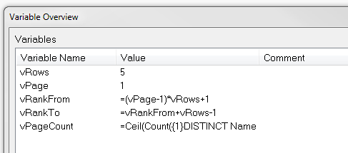
  • Create the following variables
    • vRows - contains the number of rows to display per page - 5 in this case
    • vPage - the page number. Initialise to 1 for the first page.
    • vRankFrom - the expression  =(vPage-1)*vRows+1
    • vRankTo - the expression  =vRankFrom+vRows-1
    • vPageCount - the expression  =Ceil(Count({1}DISTINCT Name)/vRows)
    • Note the = sign on the three expressions
    •  
    Set these variables


  • Create 3 text boxes
    • "Previous" or "<<"
      • Lable the first one "<<" or "Prev" (or whtaver makes sense in your situation). 
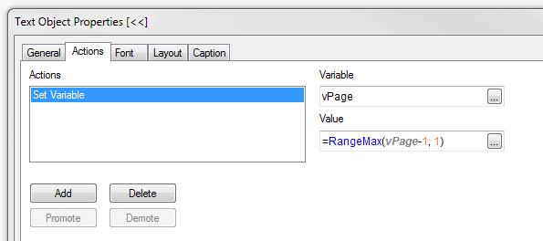
      • Create a set variable action for vPage with the following expression:
        =RangeMax(vPage-1, 1)
        .
        The RangeMax ensures that vPage will not be less than 1.
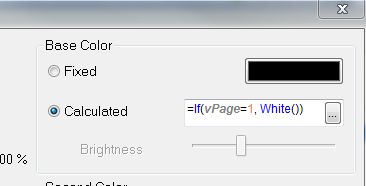
      • Optionally set the font colour to black, and add the following calculate colour expression:
        =If(vPage=1, White())
        (Set to whatever colours you like to indicate active and disabled states)
    • "Next" or ">>"
      • As above, but use =RangeMin(vPage+1,vPageCount) for the vPage set variable action and =If(vPage>=vPageCount, White()) for the calculated colour expression.
    • Page lable - this is a simple textbox displaying the expression:
      ='Page ' & vPage & ' of ' & Ceil(Count(Distinct Name) / vRows)
  • Create the chart. We need a chart with some sort of ordering such as ranking salespeople by sales volumes. In the example the chart expression is simply Sum(Value), and we will sort by this value. The dimension is the field [Name]. To adapt it to work with the ranking, use the following calculated dimension to limit the values to the current page:

    =Aggr(If(Rank(Aggr(Sum(Value), Name)) >= vRankFrom And Rank(Aggr(Sum(Value), Name)) <= vRankTo, Name), Name)

    (The ranking functions wrap the chart expression (red) returning the dimension values (blue) that fall inside the range specified vt the vRankFrom and vRankTo variables). 
  • On the sort tab, select Sort by "Y-value" descending.
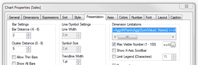
  • One the Presentation tab,  check the "Max Visible Number" box and enter the expression =vRows in the expression box.
Here is a QV document that implements the paging described above:

DataPaging.qvw


Action for previous button
Colour settings for previous button

Max Visible Number setting on Presentation tab


January 5, 2013

Handy data discovery tool

Here's a handy tool to assist in the early development and analysis of the data coming into your Qlikview documents.  There are three objects that you can copy from the attached Qlikview document and paste into your document. You do not need to modify your data model or load script in any way as these objects use standard QV built-in fuctionality.

  • A tree-view list box with the tables and fields in your data model
  • A text box containing summary statistics for the selected field (hidden until a field is selected)
  • A dynamic list box containing the distinct values of the selected field (also hidden until a field is selected)

Here is a Qlikview document containing the 3 objects. Select a field name (any one) to make all three visible and copy from tis document into your Qlikview document.

Data Discovery.qvw

Creating the tools yourself

 If you are using QV Personal Edition, you will not be able to open the attached document, so here is how you can create these objects

The data structure listbox

Create a list box, select in the Field box, and enter the following expression:

=Aggr(Only({1} $Table) & '|' & Only({1} $Field), $Field, $Table)

Then check the "Show as TreeView" option and enter the vertical pipe "|" as the separator.


The text box

Create a text box, and add the following expression:

=Num(Count(Distinct [$(=$Field)]), '# ##0') & ' unique values
' & Num(Count([$(=$Field)]), '# ##0') & ' total values ('
 & Num(Count([$(=$Field)]) / (Count([$(=$Field)]) + NullCount([$(=$Field)])), '0%') & ')
' & Num(NullCount([$(=$Field)]), '# ##0') & ' null rows
' & Num(Count(If(Len([$(=$Field)])=0, [$(=$Field)])), '# ##0') & ' empty values'


On the Layout tab, add the following conditional expression:
Count($Field) = 1

The dynamic list box


Create a list box, select and add the expression:
=[$(=$Field)]

On the Layout tab, add the following conditional expression:
Count($Field) = 1

Conclusion

Remember to select a field in the data discovery list box to see the other two objects. Feel free to use and modify the objects in any way you please. With all the usual disclaimers...


October 16, 2011

Dual values for “self-sorting”

Sometimes you need a field that has a unusual sort order. For example, you might have an a range field that contains values <0, 0-10, 10-100, >100. When you use this field as a dimension in a table or chart, you will want to sort this in the order above. In many cases, this can be done by using the “Load Order” option, but there are cases where the natural load order may not work (calculated fields, for example).

The load order is also of no use if you plan to use the field in a rank expression.

In these case, one option is to create dual values for the field. A dual value contains a text representation and numeric value. Dates are numeric, containing the formatted date and numeric date representation. They display the formatted date, but sort using the numeric value. You can also perform arithmetic on the numeric value. But did you know that you can create your own, custom, dual values?

To do this, use the Dual() function. This is an example of a calculated field using Dual:

LOAD

...

If(IsNull(PaymentAmount) Or PaymentAmount = 0, Dual('None', 0),

If(PaymentAmount > 0.9 * ExpectedInstallment Or IsExempted, Dual('>90%', 90),

If(PaymentAmount > 0.5 * ExpectedInstallment, Dual('50 - 90%', 50),

If(PaymentAmount > 0 Or InSuspense, Dual('0% - 50%', 1),

Dual('Reversal', -1))))) As PayGroup,

…

FROM …

In this example, the load order does not reflect the required sort order, but values of Paygroup will sort according to the numeric value:

Reversal, None, 0% - 50%, 50% - 90%, >90%

Just remember to ensure that the “Numeric Value” sort option is selected when you need this sort order.

August 21, 2011

Howto: Create a Waterfall Chart

A waterfall chart is a type of cumulative bar chart, where each bar begins at the previous cumulative total and has a length equal to the value at that dimension (positive or negative). Something like this:


So, how do we go about this.

CREATE BAR CHART
Create a bar chart with the dimension you require for the X axis, and the following expressions:
  • Total (this is the value for the final, total bar - green in the example above)
  • Value (this is the value for the blue and red bars - rename as appropriate)
  • Cum (this is a hidden value which tracks the cumulative value)
For example, let's have a simple data set with fields Dim1 and Value1. There is a dummy Total with Dim1 = Total, Value1 = 0.

Use the expressions:

  • Total: If(Dim1 = 'Total', Sum(Total Value1))
  • Value: Sum(Value1)
  • Cum: RangeSum(Above(Column(3)), Column(2))

Set Cum to Invisible on the Expressions tab of the chart properties.

MAKE THE WATERFALL

The trick now is to use the bar offset on the Value expression and use this expression:

=If(IsNull(Above(Column(3))), 0, Above(Column(3)))+if(Column(2)<0,Column(2),0)

Click the + sign next to the expression name in the Expressions tab to see the Bar Offset.

That should do it. You can download a demo here : Waterfall demo

To colour the negative values red, set the Background Color for Value to the expression:

=If(Column(2)<0, RGB(200,110,130))

Have fun!

May 30, 2011

Faulty Sorting

I recently had a problem some straight table charts in a model that would allow sorting in only one direction. In other words, double clicking the header would sort by that header, but double clicking again would not reverse the sort direction. In fact, only the direction set in the Sort tab of the chart properties would work.

The chart had normal dimensions and expressions and no apparent reason for this behaviour.

The problem turned out to be that the first expression had been disabled. When I deleted this expression, sorting returned to the normal behaviour.

The lesson I learned here was that if I want to disable an expression during model development, demote it so that it is the last rather than the first expression in the chart.

Using QV 10 SR2

April 25, 2011

Understanding Duals

QV stores all numeric data (numbers, dates, time, intervals, etc) in what is called “dual” format. Understanding dual format may help in overcoming some model pitfalls and may assist in solving some problems.

In brief, a dual format value comprises and numeric value, and a text representation. These may be standard number or date formats, they may be built in series (eg months, days of the week) or any customised series (more on this in a later post). The text representation is the equivalent of a format, but it can be more than that.

To illustrate, the number 40658 could represent:
  • The value 40658. Depending on the format this could be displayed as 40,658 or 40658.00 etc.
  • The date 18 April 2011.
  • A product (or customer or branch or region etc) code 0040658
  • etc

The number 0.65 could also represent:
  • A percentage - 65%
  • The time of day 3:36 pm (0.65 of a day of 24 hours from midnight to midnight)
  • An interval of 15 hours 36 minutes (0.65 of 24 hours)
  • Etc

The format can be created implicitly by QV. During a load, it will infer the format from the source data. If a certain column in a CSV data source contains numbers:

8.35000
9.15000
3.62333

Then QV will infer a format of 0.00000 for that field. Certain QV date and time functions also create the output in the default time and date format for your model.

Taking control – formatting commands

By default, QV will display the text portion of the dual on text boxes, captions, dimension/expression labels and the like, and will use the numeric portion for arithmetic expressions.

You can also manually control this with the Num() and Text() functions. For example, if a field “TimeElapsed” represents an interval with a value of 0.25 (6 hours), then Num(TimeElapsed) will return 0.25 and Text(TimeElapsed) will return 06:00:00 (assuming your default interval format is hh:mm:ss).

Some functions (like Min, Max, Avg) only return the numeric part of the expression, others return a dual value - check the return type in the auto-completion prompts or the documentation.

The formatting commands (Num(), Money(), Date(), Time(), TimeStamp(), and Interval()) allow you to control the text representation. It is worth pointing out that they have no effect on the numeric portion.

For example, Date(40651.65, ‘YYYY/MM/DD’) will display 2011/04/18, but the numeric value is still 40651.65. In other words, the Date function does NOT truncate the fractional part of the value, it simply does not display it. (To remove the time from date/time values, use Floor()).

That provides a very simple conceptual overview of dual values and formatting in Qlikview and I hope it helps with your understanding of dual values.

I will address some of “dual” issues in a little more depth in further posts on this site in the near future. I value your feedback and any topic suggestions or questions.

February 7, 2011

When Totals Don’t Work

Qlikview (QV) provides for three types of totals in straight tables and pivot tables:
  • None
  • The expression calculated at the total level
  • Aggregate function (sum, average, minimum etc) of the table rows

These options cover most cases, but sometimes you have a table where none of these options is appropriate, or provides the correct result. As an example, consider a table of absolute variances, such as budget amount vs selling amount, on a table dimensioned by product class. The expression for the variance and % variance would be:

[AbsoluteVariance] = Fabs(Sum(BudgetAmount) - Sum(SellingAmount))

[%AbsoluteVariance] = Fabs(Sum(BudgetAmount) - Sum(SellingAmount)) / Sum(BudgetAmount)


These expressions yield different results for a different degree of dimensioning, so the sum of the absolute variances per ProductClass is not the same as the absolute variance at the total level. Therefore, the AbsoluteVariance column needs to be totalled using the Sum of rows option. For the %AbsoluteVariance, however, the expression at the total level does not work for the same reason, and the summing of the rows is arithmetically meaningless. In this example, a total is required for both of these columns.

So, how do we construct an expression that will produce the correct %AbsoluteVariance for each row and for the total?

We have the expression for the rows:

[%AbsoluteVariance] = Fabs(Sum(BudgetAmount) - Sum(SellingAmount)) / Sum(BudgetAmount)

For the total, we need an expression like:

[%AbsoluteVariance] = Sum(Rows of AbsoluteVariance) / Sum(BudgetAmount)

Assuming that ProductClass was the only dimension on the table, the Sum(Rows of AbsoluteVariance) can be calculated as follows:

Sum(Aggr(Fabs(Sum(BudgetAmount) – Sum(SellingAmount)), ProductClass))

So, how do we differentiate between the two expressions?

This is where the QV Dimensionality() function comes in. In our case, Dimensionality() will return zero when calculated on the total row, and greater than zero elsewhere. Check the Qlikview Reference Manual for more information on the function.

Our final expression becomes:

If(Dimensionality() = 0,
// total row expression
Sum(Aggr(Fabs(Sum(BudgetAmount) – Sum(SellingAmount)), ProductClass)) / Sum(BudgetAmount),
// other row expression
Fabs(Sum(BudgetAmount) - Sum(SellingAmount)) / Sum(BudgetAmount))

QED

Unzip the download here and play around with a sample QVW model and the Excel source file.